Church Philanthropies Donations
Allow quick and easy transactions through the Church of Jesus Christ of Latter-day Saints Philanthropies web donation form.

Problem
The Philanthropies online donation system took a long time to load and was prone to errors. It also had some UI items that needed to be updated, like very slow animations. We wanted to make the donation experience as smooth and friendly as possible.
Users / Constraints
We have a pretty big demographic range of users for the site, but the users we decided to focus on were women, ages 45 and older—which make up a large proportion of our donors. Some of them don't spend much time on computers and can be intimidated by complicated interfaces. They also tend to user older technology as a whole than, say, an average internet user.
Team / Roles
There were three people on the internal web team: one UX/UI designer (me), one web content specialist, and one product manager. We also worked closely with an off-site development team.
My responsibilities
- Contribute to initial needs analysis
- Analyze performance
- Analyze technical needs
- Research best prectices in design and development for web forms
- Design standard elements
- Design interface
- Write interface labels, text, and errors
- Develop production-ready front-end code (HTML/CSS/JS)
- Test interface prototypes
- Assist back-end team implementing new system in Adobe Experience Manager
Guiding Principles
Based on the frequent use of older technology and the nature of many of the errors we saw with the previous form, I determined that the page should be as “bulletproof” as possible. That meant, in true progressive enhancement fashion, that it should use only standard form elements, and function even without javascript (it's just a form, after all). I decided to make liberal use of progressive disclosure (when javascript was enabled) to keep the form from becoming overwhelming. It also needed lots of inline error-checking to catch as many mistakes as possible in a friendly, intuitive way before sending the form back to the server. Finally, I decided to employ a lot of subtle UI animations to help users more easily keep track of what was happening on screen.
Process
Research
We started with a list of issues that had come from support calls over time. I focused more of my initial attention on learning about the latest research into form design. I took online courses, read extensively, and experimented.
Design
I built a few static mockups to work with visual identity and form components, but quickly moved to HTML prototyping so I could design the full experience, including animation.
Test
I worked with our product manager to design user test with a few short tasks that would help us evaluate the design. I made adjustments based on our observations and feedback.
A few of my favorite things
Sweet animations
I wanted to really fine-tune the interface animations, and make sure they were very consistent across the whole page. CSS animations offer more control over easing than javascript, but I needed to use both in some places. I wrote my own javascript animation engine, which weighs under 5K and mirrors the cubic-bezier easing control in CSS. It took quite awhile to work out the math, but I think the polish of the result was well worth the effort. I also made sure all movement and state changes on screen implemented the animation engine, so the interface has a very smooth, finished feel to it.
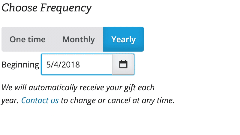
Super-easy radio buttons
One of the problems we've observed is that some people have difficulty selecting controls with very small targets, such as standard radio buttons or checkboxes. It helps to make the labels selectable, but not everyone takes advantage of that. I opted to enlarge the radio button labels and make them into the only targets, creating a set of toggle buttons.
A robust error system
I wrote an extensive javascript error module along with descriptive error messages to help people feel supported and to help them correct mistakes quickly. It covers lots of different scenarios, and even recognizes the peculiarities of things like international postal addresses.
Quick and easy search
The previous system had used a fairly slow server call to search through the hundreds of funds available for donation. I moved it to a front-end function, with a JSON list for data (loaded asynchronously, of course). This provides an instantaneous, search-as-you-type interface. I also added some filtering options to help narrow things down.

Success measures
A successful solution would:
- Reduce errors from the interface that prevented people from donating,
- and speed up the page,
- both of which should reduce the service calls
- and ultimately result in a higher number of successful donations.
The page size went from over two megabytes down to under 200K. The number of network requests and the page load speed decreased dramatically. When we launched the new donation page we expected a few service calls just because of the new interface, but we didn’t even get that. We've continued to have very few, if any calls related to the interface since launch. Donations were up by 40% between 2016 (when we launched) and 2017.