Learning Suite LMS
Enable professors and students to interact effectively online.
Problem
We needed to replace BYU’s learning management system (LMS) with a new product capable of integrating directly with university systems, and able to handle the needs of professors and students across campus. It had to include a calendar system, discussion boards, assignments, gradebooks, exams, course documents, messaging, and an easy syllabus builder.
Users
This product serves all users of Brigham Young University courses. Course instructors use the teacher interface to create and manage course content and interactions. Students use the student interface to view course content and to interact with instructors and peers.
Constraints
One of the biggest challenges we faced was striking the balance between the needs of professors and students. Course organization styles varied wildly between professors, and many of them were reluctant to even move to a new system, let alone reorganize their entire course to fit a particular paradigm. On the other hand, students only ask for consistency between their courses. They want to know exactly where to go for all of the essential course materials and information, and it frustrates them when professors vary too much.
We also operated under some pretty heavy time constraints. The university had an aggresive deadline for dropping the old system, which gave us less than a year to have the new system built, tested, and ready for professors. We had to make tough decisions about what was really essential for the campus release.
Team / Roles
The team consisted of two lead developers, one UX/UI designer (me), and several instructional designers. We also had many student developers and testers working under supervision of the lead developers.
Instructional designers were responsible for gathering requirements, helping to align our interface with current research on education practices where needed, creating wireframes, and giving feedback on designs.
My responsibilities
- Create and maintain design system and components
- Write style guide
- Build style guide website
- Write HTML so devs can implement style guide
- Write and maintain all CSS
- Train all team members to use style guide
- Train developers to write standards-compliant web code
- Write javascript for some complex interactions
- Write interface copy and labels
- Write most interface messages (success, error)
- Write back-end code as needed
- Review developers’ functional interfaces
- Create HTML mockups for demonstration and testing
- Create annotated design mockups for every state of every interaction (over 700 pages of high-fidelity screen designs)
- Organize, maintain, update, and share all UI design files
- Convert site to function in mobile browsers
- Consult on design of university IOS and Android apps
“I worked very closely with Nate for several years, designing and implementing an enterprise-wide learning management system for a large private university. Nate was instrumental in ensuring a consistent, well-tested, user-centric design throughout all of the components of the product. His work was invaluable!”
Guiding Principles
Based on the needs we had and the constraints we were working under, I wrote this set of guidelines with some input from the team. With such a tight schedule, we needed to spend our energy on the things that would matter most to our users. (Point 5 was written specifically for the benefit of some of the young devs on the team.)
-
Simplify
- Design each page from the core out
- Remove or hide all non-essentials
- Define good defaults (don't add preferences)
-
Enable relationships
- Communication between instructor and student
- Student to student
- Instructor to instructor
-
All surprises should be pleasant
-
Every millisecond counts
- Treat users' time as sacred
- Even small performance gains are worthwhile
- Streamline data entry and other tasks
- Don't make users do things twice
-
"Functional" is not "finished"
- An unfinished feature might be worse than no feature at all
- The last 10% makes a huge difference
- Polish breeds trust
-
Start up with style, fail with grace
- There are three states to every screen: blank, normal, and fail
- The initial screen (with no data) is the first impression
- Don't abandon users in their moment of need
Process
Research
Initial research and requirements-gathering was conducted by the instructional designers on the team. They often met with professors and could gather a good picture of what they needed. We also leveraged our usage statistics to gain insights on how the product was being used and how it might improve. As the UI became more established later on in the project, I participated in focus groups, observation sessions, and user interviews.
Plan and wireframe
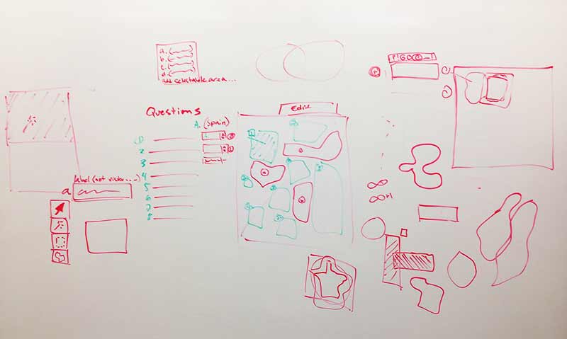
Design for a feature usually started with a whiteboard session (or several) which included me and an instructional designer. Once we came to agreement on the general layout, they usually created the wireframe from that discussion. This was a very fluid part of the process, and each of us contibuted to the UX design of a given interaction. There were sometimes several rounds of discussion and wireframing.
Design UI
I was solely responsible for designing the UI. I created hundreds of screen mockups with notes, instructions, and cross-references to clearly document and articulate the design to developers.
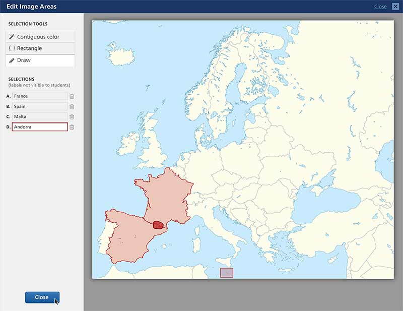
For any complex interaction I also created an HTML mockup for review and testing. This was especially true for screens that required animation or interactive visual feedback to the user. I built those interactions myself and then passed them to developers.
Develop
Developers used the UI design system to implement new designs. I consulted with them as needed throughout the build process, and reviewed the final result.
Test and gather feedback
Once a design was built in our testing environment, our regression testing team wrote and tested their scripts for how the interface was intended to work. Once it was working as designed, we reviewed it and showed it to users before final release. Big features were released to selected professors for real-world testing and feedback before final release.
I also made it a practice to “eat our own dog food,” as one of the developers used to say. I actively taught evening classes in the BYU design department and (of course) used Learning Suite wherever it made sense. I found that directly using the product uncovered many opportunities for me to suggest or make improvements.
A few of my favorite things
Smart syllabus builder
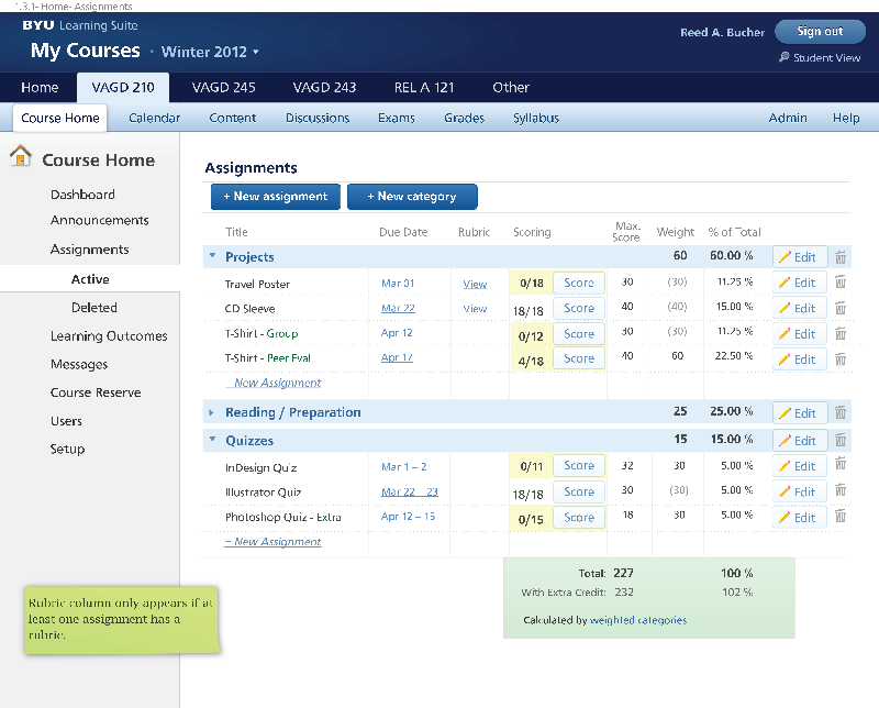
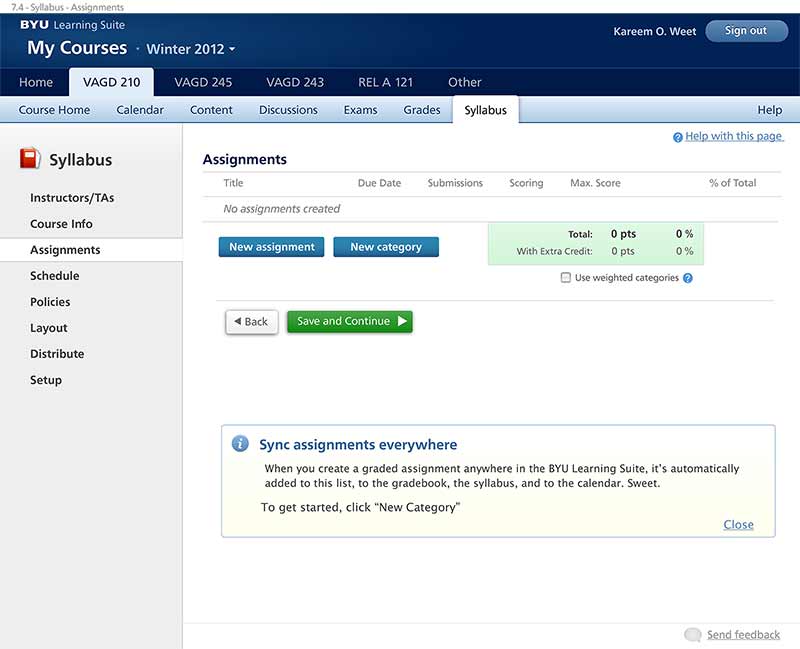
Adapting a course schedule to a new semester is a time-consuming task. It can also be error-prone because you need to account for university holidays and other scheduling anomalies. We built a syllabus tool that could automatically transfer assignments to a new semester and make a really good guess at where they should be placed. It even converts from semester to term and back. Once instructors enter their assignments in Learning Suite, it became easier to maintain from semester to semester.
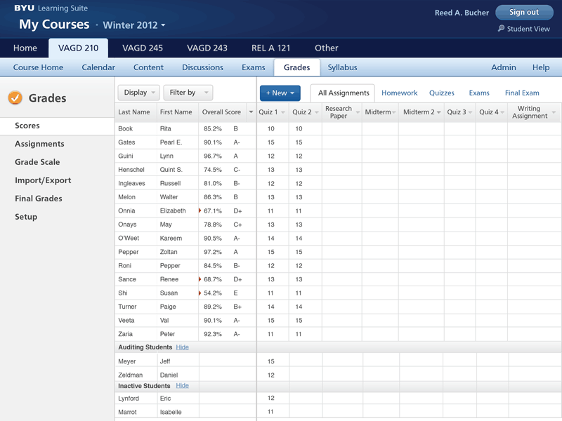
Fast gradebook
We recognized the burden that professors have inputting hundreds of grades. We equipped our gradebook spreadsheet with lots of standard keyboard controls to make this as quick and painless as possible.
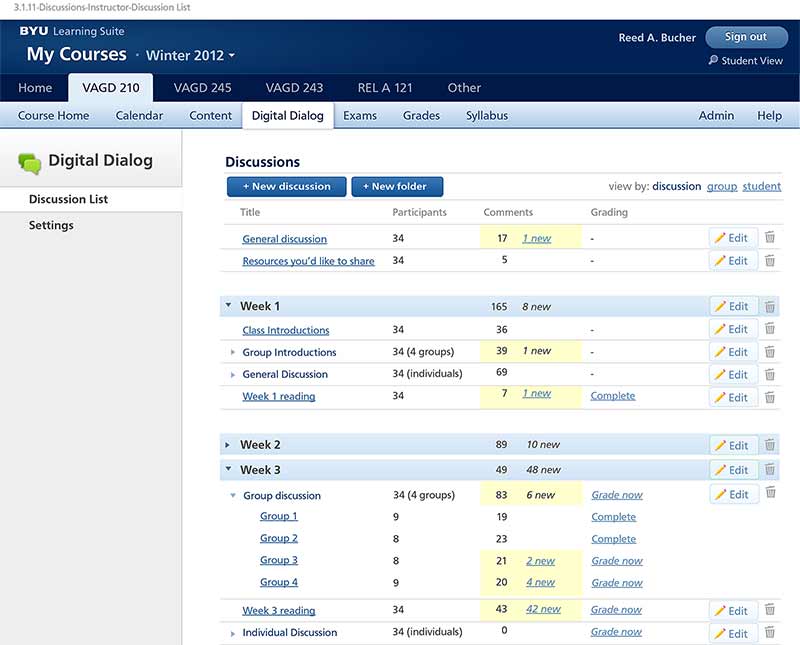
Streamlined feedback
We wanted to encourage interaction between professor and student as much as possible, especially in giving and getting feedback on assignments and tests. We used our discussion tool to enable not only text, but also audio and video feedback on students’ work.
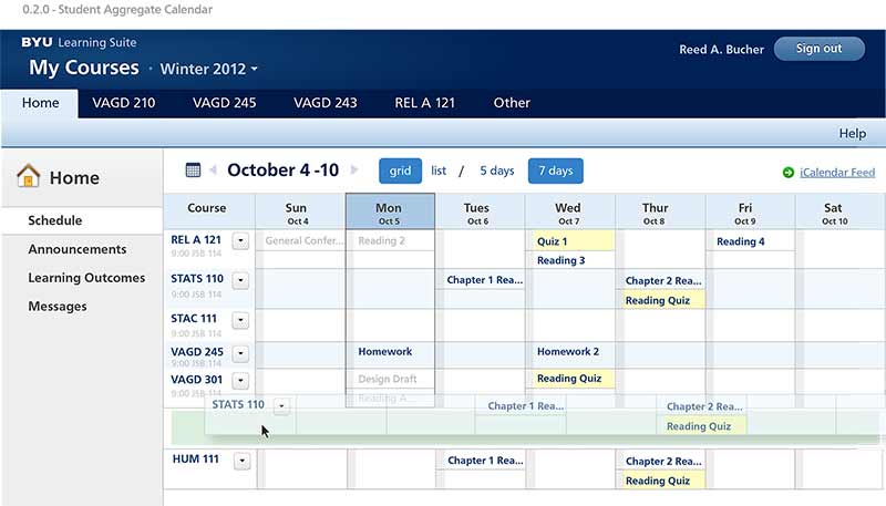
Integrated calendar
One of the daunting tasks for students is keeping track of six or eight different schedules. We were able to take all of the calendars from all of their classes and combine them into a single view.
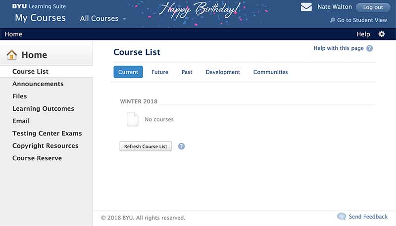
Holiday greetings
Finally, I really wanted the system to have some personality rather than being just another cold corporate interface. I convinced the developers to give me CSS hooks to decorate the interface for holidays. On those days you could use the Konami code (hello, NES) to unlock snowfall or other fun visuals. It could even wish users a happy birthday.
Success measures
Measuring our work on this project presented a few challenges. First, any fine-tuned quantitative measurements were left out of the first release in favor of just finishing the baseline features for instructors and students. We did track adoption rates, which increased each semester. The number of university courses using Learning Suite eclipsed the previous LMS after a few semesters, which we interpreted as a very positive trend. It currently enjoys usage rates that are significantly higher than the previous system.
We had several sources of qualitative feedback. There was a prominent Help feature within the interface. We made members of our team available for direct feedback electronically or in person. We also engaged in interviews, focus groups, and surveys. All of this helped us populate our bug tracking system and also define our roadmap and releases. As you might expect, support tickets have decreased over time and feedback has become more and more positive.
Takeaways
The further I get from this project the more amazed I am that we pulled it off. Part of that success came from extremely dedicated and hard-working lead developers. One of the things I appreciate most about them was that they cared about the user experience and often offered good feedback on my work. The other thing I think that made it work was a design system that was established right out of the gate, including visuals and front-end code for many standard components. That allowed both design and development to communicate effectively and work quickly.