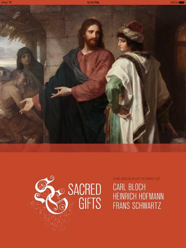
Sacred Gifts Exhibition App
Enhance the exhibition viewing experience.
Problem
The museum was hosting a once-in-a-generation exhibition of Carl Bloch’s artwork, many pieces of which had never left their permanent display locations in Europe (and probably never will again). The curators and directors wanted to produce an iPad app to help patrons more fully appreciate the pieces in the exhibition. The app needed to enhance—but not distract from—the actual artwork. The museum had gathered extensive research, interviews, and other multimedia that they wanted to have integrated into the app.
Users
This app was meant for museum patrons who were inside the museum viewing the exhibition. We wanted to make sure it was usable for adults of any age, and kids down to about eight years old. A secondary audience included people who were not at the exhibition but still wanted to view the artwork (since the app was downloadable in the app store.)
Constraints
In order to accommodate such a range of ages we had to make sure all tap target were extremely easy to recognize and to hit. Navigation was intended to work well within the context of the exhibition, which meant that all artwork had to be quickly findable from any place in the app. We also needed to fit visually within the overall context of the exhibition design.
Team / Roles
We had a small team for the iPad app, with me, a developer, and a design student who was working for me. We worked closely with a larger museum group that included museum direcors, curators, and exhibition designers.
My responsibilities
- Consult with the committee and the developer on the organization of content for the app
- Design the interface
- Produce all graphics files
- Mentor and support my student in design and production
Guiding Principles
The most important thing for me was to get out of the way of the artwork. I wanted it to be front and center, with minimal distractions. I also wanted to give the best possible experience for those not physically in front of the work.
Process
Research
We actually started with some research from a previous app that had been developed. They gained some insights, especially about non-standard navigation, which we incorporated into this app design.
Design
To begin, I designed several versions of the main screens (with some support from my design student) and presented them to the committee for review. Based on their approvals and feedback, we created a design system for the app which we applied to all of the screens and screen states. We continued to refine the system throughout the development process, as screens became live in the test app.
Production
To produce the hundreds of graphics needed for the app, I created separate documents for each type of image. In each document I created artboards for every image instance, and made sure to name each artboard in a standard way to enable consistent, fast export of final artwork. I also did a lot of automation for the tedious tasks of sizing and moving artwork into the proper places within the app source. (I got a lot of good experience with Applescript.)
A few of my favorite things
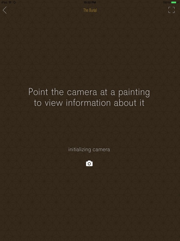
Navigation via camera
One innovation we worked on was allowing people to use the device camera for navigation. People could tap the camera icon to activate the camera, focus on a particular artwork, and the app would automatically navigate to the information page about that piece. Our developer actually suggested the idea and did an awesome job developing this feature.
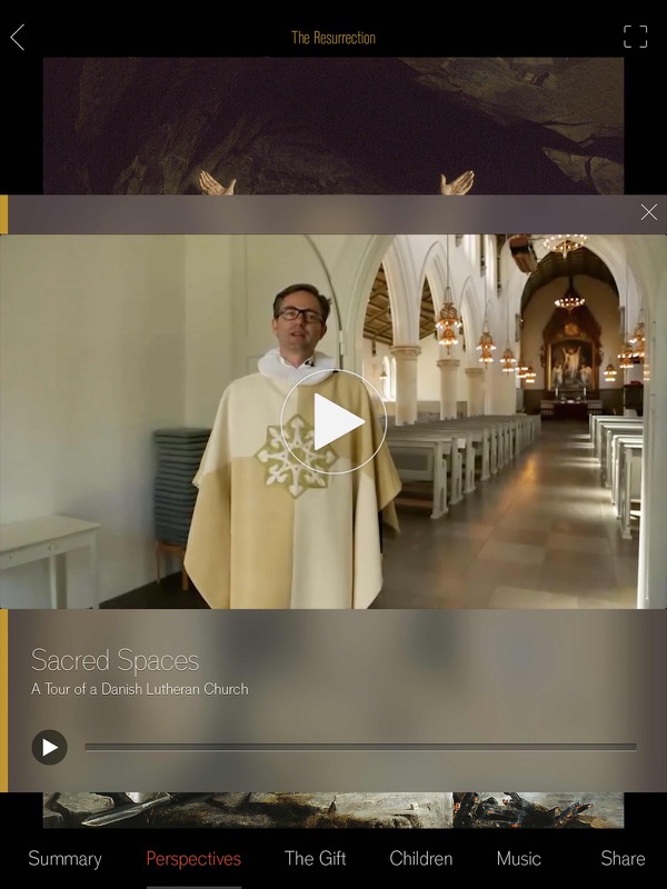
Multimedia supplements
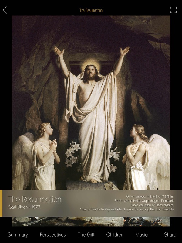
I love the way we were able to support the viewing experience with lots of interesting audio, video, and activities. We made sure each text screen had audio narration available, allowing people to continue looking at the artwork while listening to the information. For some pieces we had appropriate music, including an organ performance from the church where one of the altarpieces is housed. There were interviews with those who have loved and cared for the artwork for generations. We also included panorama tours, interactive highlights of particular details, a children's section with appropriate activities, scholarly commentary, and a timeline.
The opening video
While I didn’t create it, one of my favorite parts of the app is the introduction video. The student group that produced it did an amazing job.
Success measures
This exhibition was one of the most-visited of all time at the BYU Museum of Art. The museum iPads were extremely popular throughout, so the usage numbers indicate that the app was successful. We also kept track of direct user feedback, which was overwhelmingly positive. We made a couple of updates during the run to fix small bugs that had been reported. The app is currently rated 4.6 out of 5 in the app store. The most recent reviews were entered in 2016, years after the exhibition had ended. They still give the app 5 out of 5 stars, so our secondary goal of making the app valuable even outside the exhibition seems to have been successful as well.
Takeaways
If I had it to do over again, I would incorporate user testing throughout the process. The museum staff, who already knew a lot about the exhibition and had a vested interest, did a lot of the pre-release testing. They were happy with the product, but we had no way of knowing how it would be received until the actual exhibition opening.